
Explain The Inverse Cdf Method
In this note, I’ll show a pictorial proof of the inverse-cdf method, used to generate samples of any random variable, as long as we know its cdf. I have read many algebraic proofs, but it never clicked until I drew it out.
import numpy as np
import matplotlib.pyplot as plt
import scipy.stats as st
%matplotlib inline
plt.style.use('ggplot')
x = np.linspace(6,-6,100)
plt.figure(figsize=[10,5])

plt.subplot(121)
rv_norm = st.norm()
plt.plot(x, rv_norm.cdf(x))
for k in np.arange(0.1, 1, 0.1):
    plt.arrow(-6, k, rv_norm.ppf(k) + 6, 0, ec='b', fc='b', head_width=0.05, head_length=0.3)
    plt.arrow(rv_norm.ppf(k), k, 0, -k, ec='b', fc='b', head_width=0.05, head_length=0.3)
plt.ylabel("normal-cdf(x)", fontsize=15)
plt.xlabel("x", fontsize=15)

plt.subplot(122)
rv_exp = st.expon()
plt.plot(x, rv_exp.cdf(x))
plt.axis([0,4,0,1])
for k in np.arange(0, 1, 0.1):
    plt.arrow(0, k, rv_exp.ppf(k), 0, ec='b', fc='b', head_width=0.05, head_length=0.1)
    plt.arrow(rv_exp.ppf(k), k, 0, -k, ec='b', fc='b', head_width=0.05, head_length=0.1)
plt.ylabel("exponential-cdf(x)", fontsize=15)
plt.xlabel("x", fontsize=15)
Text(0.5,0,'x')
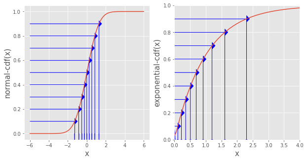
Inverse cdf method
Step 1. Generate a uniform random variable \(y\)
- I choose a bunch of points on the y-axis that are equally spaced from 0 to 1. These \(y_i\)’s constitute our sample of a uniform random variable
Step 2. Find \(x_i = \text{inverse-cdf}(y_i)\) for each \(y_i\)
- We find the corresponding \(x_i\) for each \(y_i\) by drawing an arrow from \(y_i\) to the cdf curve, then down to the x-axis
- Notice how \(\text{cdf}(x_i) = y_i\) as desired
Following these steps, the \(x_i\)’s we generated in Step 2 is a sample of a random variable with the plotted cdf.
Intuition
Why are the \(x_i\)’s the sample that we want?
Look at the left panel where the red line is the normal cdf. Even though the \(y_i\)’s are evenly spaced (i.e. uniformaly distribute), the \(x_i\)’s are much more closer to one another near mean 0 because the red line (normal cdf) rises much quicker near 0. In other words, we generate \(x_i\)’s in a way such that we get more \(x_i\) where the cdf rises quicker. This makes perfect sense, because between a range \([c_1, c_2]\), the more \(x_i\)’s there are in that range, the more the cdf increases.
As another example to see more clearly the different gaps between \(x_i\)’s, look at the right panel where the red line is the exponential pdf. The \(y_i\)’s are still uniformaly distributed, and the \(x_i\)’s are much denser near 0 than farther away, as expected of a exponentially distributed variable.
Leave a Comment